
This seems like a good place to start. And this does show that I do know what’s going on. A little bit, anyway!
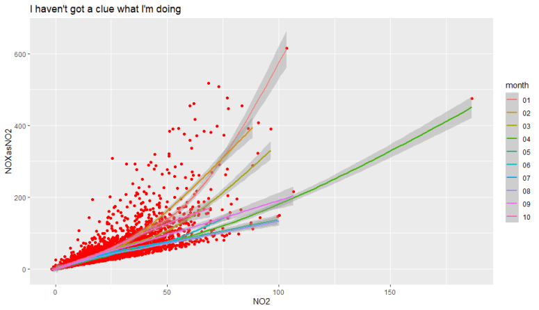
The chart above is showing the data points of two pollution measurements from my local air quality station, taken from the Air Quality England website. And at 1040 on 22nd October 2020, the air looks like this:

Here’s an example of some of the data I downloaded. The limited date ranges meant that I had to join several downloads together. Ideally, I would select 2012 to 2020. And I see no reason why this wouldn’t be possible. It is good that the information is available, but creating a useful dataset takes a little bit of effort.
| End Date | End Time | PM10 | NO | NO2 | NOXasNO2 |
| 01/10/2019 | 01:00:00 | 19.2 | 1.1833 | 1.61945 | 3.43381 |
| 01/10/2019 | 02:00:00 | 20 | 1.09786 | 2.10297 | 3.78633 |
| 01/10/2019 | 03:00:00 | 30 | 0.87466 | 1.31747 | 2.6586 |
| 01/10/2019 | 04:00:00 | 28.3 |
View original post 290 more words
